
From Artwork to Street: How a Wheatpasting Campaign Actually Gets Made
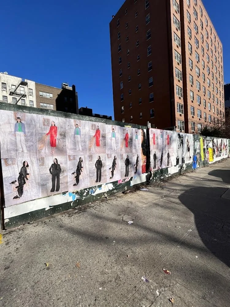
Fashion wheatpasting wildposting installation for Rosetta Getty on an urban construction wall
A wheatpasting campaign can look spontaneous once it hits the street. Fresh posters appear overnight, a block changes character, and a brand suddenly feels present in the city. What people rarely see is the production system behind that moment.
The real process is closer to a tightly managed outdoor media rollout than a simple print job. It starts with a print-ready PDF, moves through location strategy, file prep, production, routing, field installation, and ends with documented proof that every placement happened where it was supposed to. That structure is a big reason wheatpasting remains effective. It keeps the raw energy of street culture while operating with the discipline that brands and agencies expect.
Wheatpasting campaign planning starts before anything gets printed
The first stage is not printing. It is translation.
A design that looks sharp on a laptop screen may fail on a wall if it is not built for distance, speed, and context. Street viewers are moving. They may be walking, biking, driving, or simply glancing while juggling a dozen other stimuli. Wheatpasted artwork has to read instantly.
That changes the creative brief. Type has to be legible from across the sidewalk. Contrast has to survive uneven surfaces and changing light. Logos cannot sit too close to edges that may overlap, wrinkle, or catch wall texture. If a poster is going up in multiple panels, every panel break has to be accounted for before the file is approved.
A strong print file for wheatpasting usually accounts for a few practical realities:
bold headline hierarchy
minimal clutter
clear call to action
high contrast color choices
safe margins for trimming and overlap
Teams also review what kind of install the artwork is built for. A single oversized visual behaves differently from a repeated poster grid. A fashion launch may benefit from saturation across one neighborhood. An event push may need date visibility above everything else. A product teaser may work better with repetition and mystery than with dense messaging.
Before production moves forward, the file typically goes through a street-specific preflight check.
Resolution: Large-format output needs enough detail to hold up at scale
Bleed: Extra image area helps when posters are trimmed, overlapped, or pasted on imperfect surfaces
Paneling: Oversized art often needs to be split into sections for printing and install
Color mode: Files prepared correctly for print reduce surprises in final output
Brand approvals: Legal, marketing, and creative signoff keeps revisions from hitting mid-production
Location strategy shapes how a wheatpasting campaign performs
A wheatpasting campaign is not only about artwork. It is also about geography.
The best campaigns are mapped with a clear idea of who needs to see them and where that audience naturally moves through the city. A music release may target nightlife corridors, venue clusters, and dense pedestrian blocks. A startup launch may focus on coworking zones, transit-heavy intersections, and neighborhoods with a strong tech presence. A fashion drop may do best in trend-driven retail districts where visual culture already matters.
Research on urban street advertising has long pointed to the street and pavement as active media surfaces, not passive background. That matters here. Walls, sidewalks, and corridors are part of a city’s visual culture. Placement changes meaning. The same poster can feel premium, underground, urgent, or cultural depending on the block where it appears.
This is where planning becomes highly tactical. Teams often map placements by neighborhood, foot traffic patterns, visibility windows, poster density, and local compliance needs. In many campaigns, that mapping is just as valuable as the poster art itself.
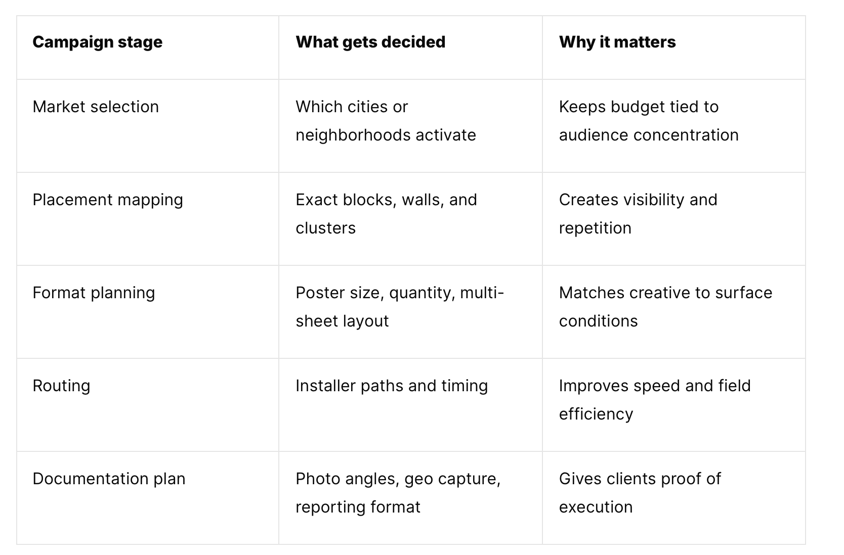
sidewalktattos campaigns processing
For agencies that work at scale, this planning is often the difference between a campaign that feels random and one that looks intentional. A mapped rollout also makes fast turnarounds possible. If artwork is approved late in the day, execution can still happen quickly when the city plan, teams, and routing system are already in place.
Printing and poster production turn a PDF into street media
Once locations and creative are locked, production starts moving fast.
Printing for wheatpasting is not the same as printing for a framed poster or retail sign. The material has to work with paste, wall texture, weather shifts, and field handling. Posters are rolled, stacked, transported, sorted by route, and applied on site. Every one of those steps affects what stock, finish, and size make sense.
Standard wheatpaste poster sizes often range from smaller formats like 24" x 36" up to larger statements like 48" x 72". Size selection depends on the wall, the neighborhood, the budget, and how much visual dominance the campaign needs. A repeated field of smaller posters can create strong rhythm. A larger format can stop people cold if the placement supports it.
Production teams are usually balancing several variables at once:
Paper stock: Strong enough to handle paste and application, flexible enough for field work
Run quantity: Based on city count, placement goals, and backup inventory
Versioning: Market-specific dates, URLs, QR codes, or language changes
Packaging: Bundled by route or neighborhood for faster installs
This is also the stage where timing becomes very real. If a campaign is launching across multiple cities, print coordination has to sync with shipping windows, local crews, and install dates. Some agencies can move from approved artwork to field activation within 48 to 72 hours, and in certain cases even faster, but that speed only works when production and operations are already built for it.
Wheatpasting installation logistics are the real engine of the campaign
Installation day is where planning gets tested.
A wheatpasting crew is not simply putting paper on a wall. They are executing a route, managing materials, adapting to street conditions, and keeping quality consistent from the first poster to the last. Surface condition matters. Weather matters. Timing matters. Local rules matter. Even pedestrian flow can affect how a placement gets handled.
The install itself has a craft component that people often underestimate. Proper paste consistency, smoothing technique, alignment, overlap, and edge adhesion all influence how the finished piece looks on the wall. A strong install looks clean, intentional, and photographable. A weak install curls, bubbles, tears, or reads as sloppy from ten feet away.
That is one reason local crews are so important in multi-city campaigns. They know the rhythm of their streets, the practical constraints of their markets, and the standards needed for quality work under pressure.
On install day, teams usually stay focused on a short set of priorities:
Route discipline: Moving through mapped placements without losing time
Surface judgment: Choosing the best wall condition available at each approved spot
Poster quality: Keeping alignment, adhesion, and finish consistent
Compliance awareness: Working within local conditions and regulations
Field communication: Reporting issues quickly so replacements or reroutes can happen
For brands, this part of the process is easy to miss because it happens outside the office and often outside business hours. Yet it is the operational core of the whole campaign. Without solid field execution, great creative and smart mapping never become visible media.
Wheatpasting photo documentation turns street action into client-ready reporting
Once the posters are up, the job is not done.
Documentation matters because wheatpasting is a live, physical media channel. Clients need proof of placement, proof of quality, and a clear record of where the campaign ran. Strong reporting closes the loop between planning and execution.
That usually means crews or project managers capture each placement with photos that show both the poster and its context. Wide shots show block presence. Mid-range shots show wall impact. Closer shots confirm artwork quality. Geo-tagged documentation adds another level of accountability, especially for campaigns spread across many neighborhoods or cities.
In a more data-focused outdoor media environment, this reporting has become a standard expectation rather than a bonus. It gives brand teams something they can review internally, share with partners, and compare against campaign goals. It also helps future activations because placement performance can be assessed neighborhood by neighborhood.
A good photo report often includes:
placement images
location references
date and time records
city-by-city rollup
notes on reroutes or field adjustments
This is also where the emotional payoff hits. What was a PDF a few days earlier is now a visible part of the city, documented and real.
Typical wheatpasting campaign timelines from artwork approval to street install
The timeline can be surprisingly short when the process is organized well.
A campaign with approved artwork, clear city targets, and preplanned operations can move from file receipt to active placement in a matter of days. Faster timelines are possible when crews, printers, and routing systems are already in place. Slower timelines make sense when a campaign includes custom formats, many creative versions, or a broader legal review.
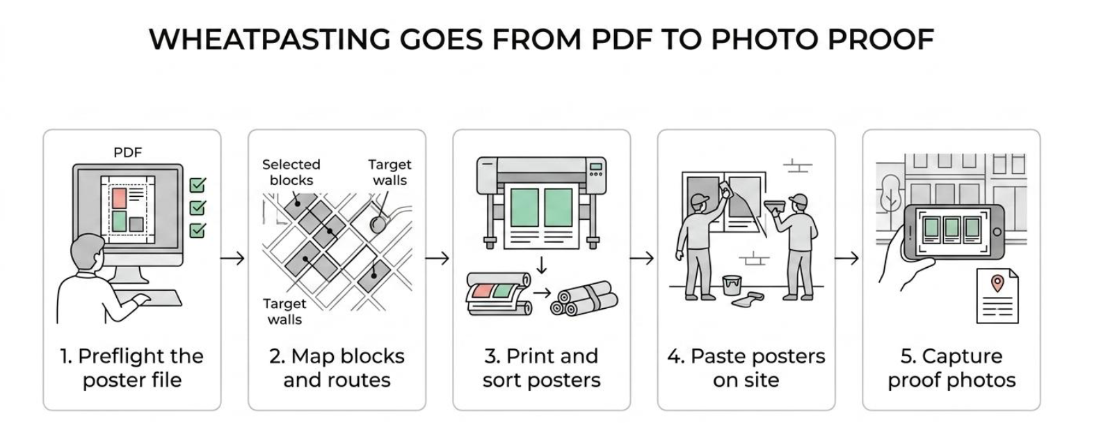
installations proof by sidewalktattos
A common flow looks like this: creative approval, file preflight, print production, route packaging, field deployment, then photo reporting. In some high-speed campaigns, those stages overlap rather than wait for one another to finish completely. That overlap is what allows a brand to respond quickly to a launch date, event window, or cultural moment without sacrificing structure.
Why wheatpasting campaigns need both street credibility and operational discipline
Wheatpasting works because it sits in two worlds at once.
It has the immediacy of street culture, with all the texture and energy that brands want when they are trying to feel present in a city. It also demands the rigor of outdoor operations, where timing, placement logic, compliance awareness, and documentation all matter.
That combination is what makes the medium powerful. A successful campaign is not only visually bold. It is planned block by block, printed with purpose, installed with care, and documented like a serious media buy. When that full chain is handled well, the result feels effortless on the street, even though it was built through a disciplined production process from the very first file.
Reach out for more information :
929.678.0235
