
The Problem With Stencils on Melrose and Fairfax: Why They Are All Stacked on Top of Each Other
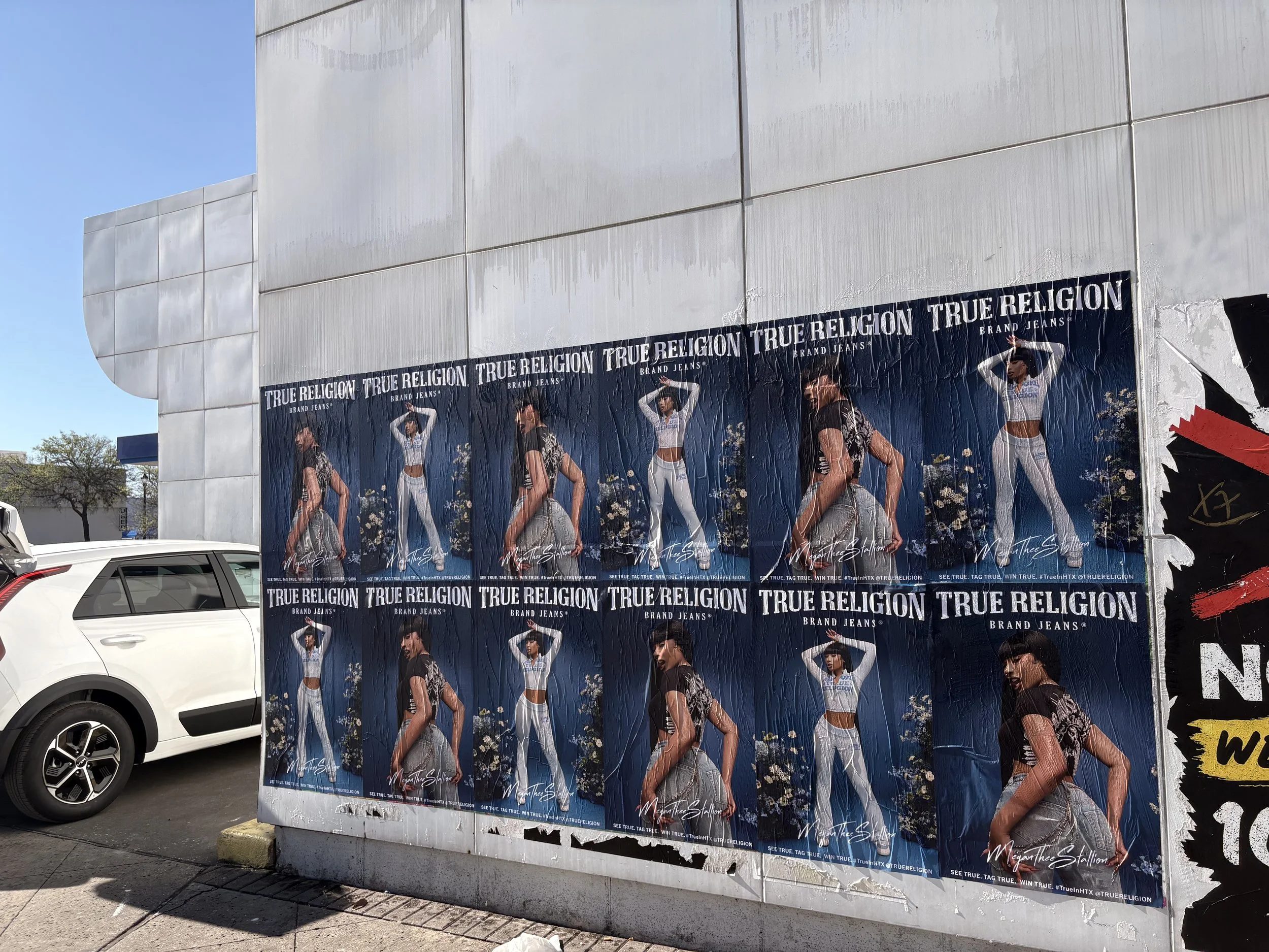
A wall covered with repeated True Religion Brand Jeans advertising posters
Melrose and Fairfax look like a dream location for sidewalk stencil marketing. The foot traffic is real, the fashion culture is visible, and the area already trains people to look down alleys, across walls, and at the pavement itself for signals of what is new. Yet that same energy creates a common problem: too many stencil campaigns end up fighting for the exact same few slabs of concrete.
The result is familiar. One message sits on top of another. A fresh logo clips the edge of a previous mark. A callout that felt bold in a planning deck turns muddy on the sidewalk because five other brands had the same idea. What should feel intentional starts to read as clutter.
That is not a failure of stencil advertising as a format. It is a placement problem.
Why Melrose and Fairfax attract stacked stencil campaigns
This corridor is not a random stretch of Los Angeles. The Melrose Arts District describes Melrose Avenue from Fairfax to Highland as home to more than 300 alternative and independent stores, with heavy interest in streetwear, vintage, accessories, and one-off retail experiences. People do not just pass through. They browse, pause, photograph, and circulate.
That matters because stencil advertising works best where people move on foot, not just in cars. A stencil can catch the eye on the way to a boutique, a café, a gallery-adjacent shop, or a streetwear drop. In a district built around walkability and visual culture, the pavement becomes media.
There is also a deeper cultural layer. City records describe the corridor as a long-running hub of creative expression and street culture, with a street-art scene that includes thousands of murals each year across walls, doors, vaults, and alleyways. In plain terms, this is a place where visual competition is normal. Brands, artists, promoters, and labels all want a piece of that attention.
So the stacking is not surprising. It is the predictable outcome of high demand meeting limited premium pavement.
Why stencil overcrowding hurts visibility
A stencil is strongest when it feels clean, readable, and placed with purpose. Once several campaigns compete in the same few zones, each one loses part of its value.
The first issue is legibility. Pavement is already an imperfect canvas. Texture, dirt, cracks, lighting, and foot wear all affect how a design reads. Add multiple layers from different advertisers, and even a strong mark can blur into background noise.
The second issue is perception. If every message is stacked at the same curb cut, outside the same high-profile shops, or near the same well-known photo walls, the campaign stops feeling sharp. It looks copied. That matters for fashion brands, events, and emerging companies that want cultural relevance rather than generic exposure.
A busy location does not automatically create strong recall.
Why placement beats volume on a dense retail corridor
The instinct in crowded street marketing is often simple: add more. More hits, more repeats, more surface area, more overlap. On Melrose and Fairfax, that instinct can backfire.
A high-frequency approach makes sense only if each placement still has room to breathe. If every activation lands in the same micro-zones, repetition stops building memory and starts canceling itself out. The viewer sees abundance, not distinction.
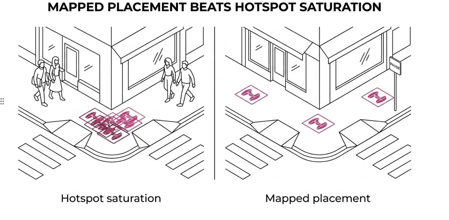
Stencil placement illustration by sidewalktattos
A smarter plan spreads attention through the corridor. That can mean selecting pavement zones based on pedestrian rhythm, sightlines, crosswalk behavior, queue areas, corner pauses, and adjacency to relevant retail categories. It can also mean mixing sidewalk stencils with wall media so the campaign feels coordinated rather than desperate.
After a disciplined placement strategy, the campaign tends to gain these advantages:
Cleaner read
Better pacing
Stronger recall
Less self-competition
More natural photo moments
The message here is simple: repetition still works, but only when it is mapped.
What causes the same pavement spots to get reused
Some of the crowding comes from habit. Certain corners have become “known” activation points, so teams keep returning to them. If one campaign got social traction there, the next ten assume the same surface will do the same job.
Some of it comes from speed. Fast activations are a major strength in street marketing, and quick rollout matters. Yet when a campaign is planned under time pressure without detailed street-level mapping, crews often default to obvious locations. Those are usually the same locations every other crew has chosen.
And some of it comes from misunderstanding how people move through Melrose and Fairfax. This area is active, but it is not uniform. One block may pull fashion traffic with phones out and high dwell time. The next may move people faster. One storefront cluster may create stop-and-look behavior. Another may create pass-through behavior. Treating the whole corridor as one flat media zone leads to stacking.
How Melrose and Fairfax foot traffic changes stencil performance
A stencil outside a destination retailer performs differently from one near a casual crossing. A stencil beside a popular café line performs differently from one placed in a transitional block where people are focused on reaching the next anchor. Density alone is not the metric that matters most.
What matters is the kind of attention available in that moment.
A useful way to think about the corridor is to separate visibility from receptivity. A crowded spot may offer plenty of eyeballs, yet very little chance for the message to land if the pavement is visually overloaded. A slightly less famous stretch, placed well, can outperform the obvious hotspot because the audience gets a cleaner read.
Here is a simple comparison.
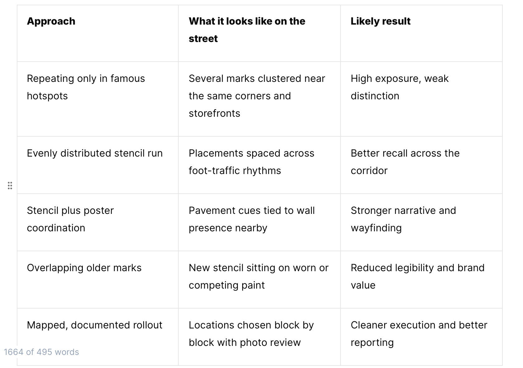
Visual representation and its impact on the street by sidewalktattos
That last row is where a street campaign starts to feel intentional instead of improvised.
Why wall-plus-sidewalk campaigns often work better here
Melrose and Fairfax are especially suited to layered street media when the layers are planned, not piled up. Sidewalk elements can guide the eye, while posters or larger wall installations carry the heavier visual message. This gives each format a job.
Sidewalk stencils are excellent for interruption, repetition, and directional presence. Posters are better for storytelling, image impact, and scale. Used together, they create a more readable sequence through the block.
This is one reason coordinated street campaigns often outperform stencil-only saturation in areas with strong visual competition. The sidewalk does not have to do everything by itself. It can act as a signal that supports a broader street-level system.
A better format mix often includes:
Anchor placements: a few high-visibility hero moments with room around them
Supporting repeats: smaller marks placed where pedestrian attention naturally slows
Format pairing: sidewalk stencils connected to nearby posters or installations
Documentation: geo-tagged photos that show coverage, spacing, and street context
That kind of structure makes the campaign feel present across the district without turning every square foot into a pileup.
Why mapped stencil campaigns outperform random density
Planning at the block level changes everything. Instead of asking, “Where is the busiest spot?” a better question is, “Where can the message be seen clearly, remembered, and repeated without collision?”
That shift leads to better distribution. It also protects the campaign from one of the biggest risks in popular street corridors: paying for visibility and getting clutter instead.
Mapped campaigns usually account for factors like:
approach direction
crossing paths
storefront relevance
pavement condition
existing media density
None of those variables are glamorous, but they decide whether a stencil reads as premium street presence or disposable noise.
The strongest street campaigns tend to feel almost inevitable once installed. They match the pace of the block. They appear in the right intervals. They do not look crammed into leftover space. That is what careful placement does.
Why cultural fit matters on Melrose and Fairfax
This district has visual standards, even if they are unofficial. Audiences here are used to murals, fashion drops, paste-ups, graphics, and constant visual updates. They can tell when something belongs to the street and when it was placed there without enough thought.
That is why simply increasing the count of stencils is rarely the answer. More marks do not create more credibility. Better context does.
For brands trying to show up well in this part of Los Angeles, the goal should be to look deliberate, sharp, and aware of the environment. The street already has personality. A campaign should work with it, not smother it.
How to stand out without adding to the clutter
There is still plenty of opportunity on Melrose and Fairfax. The corridor remains one of the most valuable places in Los Angeles for street-level visibility. The solution is not to avoid it. The solution is to stop treating the same small set of pavement zones as the whole market.
Good stencil strategy here starts with restraint. Choose fewer placements if needed. Space them better. Pair them with adjacent wall media when the creative supports it. Let each hit carry weight.
It also helps to work with crews who treat the street as a mapped environment rather than a generic canvas. Sidewalk Tattoos builds campaigns this way, using stencil activations, wheat pasting, coordinated poster installations, and geo-documented rollout to create coverage that feels intentional across the block, not stacked on top of itself.
If your campaign needs to stand out on Melrose and Fairfax, the next step is not more pavement. It is better placement. Contact Sidewalk Tattoos to plan a street activation that reads clearly, respects the corridor, and wins attention without getting buried in the pile.
Reach out for more information :
929.678.0235
